Scream
The camera shots throughout the trailer include Close Ups and Panning. The Close Ups create tension and enhance the fear of the scene. Panning lets the viewer see everything thats happening around the character and their surroundings.

Panning and Close ups of the Trailer.
The Editing of the trailer starts off slow and progresses to become quick in the middle of the trailer, this editing continues to the end. The quick editing creates a lot of tension and keeps the viewer on edge. The quick scenes don't give much away about the film but forms suspense for the viewer.
The characters consist of mainly teenagers, this is to keep in mind the target audience. The victims of the killer are all girls. This is a convention of the horror genre where the girl is used as the victim as they are seen as the weaker, more vulnerable sex. The killer is a man which supports the man being the more dominant sex. You only see the killer a few times throughout the trailer and he is in the quick editing scenes. This is also a convention of the horror genre to create fear of the killer and it keeps the viewer on edge and keeps a 'hidden' feel about him. If you were to see the killer many times throughout the trailer, the scare factor about him would begin to fade.
The Plot of the film is a serial killer who finds teenage girls and messes with them by phoning them, claiming he wants to 'play a game'. He starts off by just 'chatting' with them and it then becomes clear he is a threat to them.
The music consists of a voice over, screams, phone conversations, phone rings and quick paced music. The use of the screams are to enhance the fear from the viewer, this keeps them on edge and builds suspense. The phone rings are to highlight how the killer attacks and lets the viewer know that when the phone rings, be prepared. The use of the voice over is to let the viewer knows whats going on and to give an insight of the plot. The quick music is to keep the audience captured and is a good suspense builder.
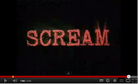
The Graphics in the trailer consist of tag lines, such as 'don't open the door'. This guides the viewer through the trailer and tells them what to fear. The writing forms from the left, its quick, and all capitals. It starts out as white and then stretches to fade, once it does this, the writing changes to red. This is to represent blood and murder. The title at the end of the trailer is again, in capitals and the font is very gritty and is in red. This gives a nerving feel and shows that something isn't right. The text is written on a black background which keeps the focus on the text and nothing else.

Writing in white and then stretching red.
Title at the end of the trailer (below).
Wrong Turn
The camera shots in the trailer include the same as 'Scream' (Close ups and Panning), however, in Wrong Turn, the ending scene uses an over the shoulder shot which creates a really good effect. All the shots in the trailer are to enhance the fear factor. The close ups enable the viewer to see the characters fear and facial expressions.

Close up (left) and Panning (right). Below is the over the shoulder shot.
The editing of this trailer is also similar to 'Scream' as it starts off slow and ends with quick editing. This builds suspense, keeps the viewer hooked and makes them want to see the film.
The characters consist of a group of teenagers/young adults (19-21). This is keeping in mind the target audience of the film. During the trailer the killers are barely seen, we can only see their hands or them from behind. There is only one full body shot of one of them and that is from a distance. This is to keep the suspense high and increase the fear factor.
The plot is a group of teenagers/young adults (19-21)
find themselves trapped in the woods of West Virginia, hunted down by "cannibalistic mountain men grossly disfigured through generations of in-breeding."
The music in the trailer contains weapon noises, heavy breathing, bushes rustling and music which is very eerie and high pitched. This is to make the audience feel uncomfortable and aware that something isn't right. The sound effects of weapons is to give an insight that people are going to die and possibly tortured. It also makes the viewer scared and uncertain knowing the killers are armed. The bushes rustling are a good location reminder, as the film is all set in the woods. This also suggests they are being watched from the bushes. The sound of heavy breathing is to increase the suspense and fear. This would also gain sympathy from the viewer, as they can tell the characters are scared.
The Graphics in the trailer consist of many tag lines, such as "some say they're insane". This trailer uses much more text than 'Scream' as there is no voice over. This means the audience need more guide through the trailer. The text is again, all in capitals and is white. It appears on the screen and highlights the words to reinforce what it says. The movie title at the end is in capitals, white and the writing is uneven. In folds in together to form what is says. The use of he uneven font is to create an uncertain feel in the viewer.


The tag lines through the trailer (left) and the title at the end (right).
Cabin In The Woods
The camera shots in this trailer, like both the others, include panning and close ups. There is also a crane shot used in this trailer which gives the viewer a good look of the surroundings.

Close up (left), Panning (right) and below is the Crane Shot.
The editing is exactly like the other two trailers, slow to start and then ends on quick editing.
The characters in this trailer are teenagers, once again keeping the target audience in mind. The teenagers are your typical type. There is the jock, the damsel in distress, the geek, the funny guy.
The plot is about f
ive friends go for a break at a remote cabin in the woods, where they get more than they bargained for. Together, they must discover the truth behind the cabin in the woods.
The music in this trailer supports Todorov's theory of Equilibrium as it begins with happy, cheerful music when the teens are leaving for a trip, then on the way there, they meet a man at the gas station who is old, creepy and dirty looking. This is where the music begins to change to loud, fast, unhappy with a heavy beat. This would be the point where the Equilibrium changes and problem has struck. Throughout the trailer there are sounds of whispers, screams and chainsaws. This is to increase the fear factor and keep the viewer captured and on edge.
The Graphics include tag lines and the movie title at the end. The text appears in capitals, white and the font is very gritty to create an edge. When the text appears on the screen it almost looks as if it is glowing and there are some flashes of white. The text fades out. The title is formed a bit differently from the other two trailers, the writing is all still in capitals, however, some of the title is in a bigger font than other parts. This is to highlight certain words to make them stand out. The writing is still white but this time instead of white flashes, the flash is red. This is to represent blood or pain. This also happens when some of the credits appear. The background when the writing comes up is different again from 'Scream' and 'Wrong Turn', instead of just a plain black background, there is a pattern. This could be some sort of representative to the film.

The tag lines through the trailer (left), the title at the end (right) and below is the credits shown through the trailer.
Conclusion
After looking at the three trailers (Scream, Wrong Turn and Cabin in the Woods) there are many resemblances between them. All the texts used throughout each trailer is in all capitals, and the font colour is white. They are each presented on a black background or a dark background. This is to maintain all the focus on the text.
The shots throughout each trailer contain mainly the same (close ups and panning). The trailers use these shots are they achieve a good focus on the fear or facial expressions the characters give. This would gain sympathy from the viewer as it would give them a clear understanding of how the characters are feeling. All the sound effects used are the typical horror conventions e.g, screams and weapons.
The editing of the trailers are all the same as they all start slow and progress faster throughout the trailer This is a really good tension builder and captures the viewers attention. The fast editing doesn't give too much away but gives an insight of the scary moment throughout the film.
Looking at these trailers, it gives us a very good guide of how our trailer should form. I think the slow and fast editing is a very good idea and could work very well for our trailer. The over the shoulder shot in the 'Wrong Turn' trailer is very effective and i think we should look into using a shot similar to that for our tailer. Each trailer contains tag lines and i think they give a good effect on the tailer, they make the viewer think and fear and they also guide you though the trailer, without having to use a voiceover. Our group needs to think of how we are going to present our title on the trailer e.g, what font, colour and size. The gritty look of the font in 'Scream' and 'Wrong Turn' looks really good and we could try a similar font for our movie title.
Looking at these three trailers has given us a good insight on how horror trailers form and what they contain, it will help a lot when coming to the construction of our trailer.


