Evaluation
by: AmyMartin94
Tuesday, 21 May 2013
Sunday, 21 April 2013
Friday, 19 April 2013
Final Evaluation - Question 4
We used InDesign to make our posters and magazine covers for our trailer.
We used Adobe Photoshop to edit any of the photos we needed for our posters etc.
We used iMovie to edit/create our trailer.
We used IMDb to look up the profiles of actors and research about the films.
We used YouTube to look at pervious and current horror trailers to gain more ideas about the horror genre.
We used Mircosoft Word to answer some of the research questions.
We also used PowerPoint to answer some of the research questions. Using these gave the blog a better look than just writing a standard posts.
We used Prezzi to answer some of the research questions. This gave us more variety in our blog posts.
We used Slide Share to upload our Power Point Presentations and Prezzi's to our blog as you can't upload them without this programme.
Thursday, 18 April 2013
Evaluation Question 2 - How effective is the combination of your main product and ancillary texts?
In this A2 year our task as a group was to create a horror teaser trailer along with a magazine cover and poster .We have created the blog,trailer and ancillary texts all under our group "Hidden Productions". As a group we believe it is very important to have continuity and combination between all of our work. Below you can see all the examples of this explained in our products.
Final outcomes of "Hidden Productions" Main products and Ancillary texts:
Teaser trailer:
Teaser Posters:


Theatrical poster:

Magazine cover:

Subscribers edition magazine cover:

All the way through the project and development we have tried to make this very clear in the main products and ancillary texts by including our recognizable logo in all. Below you can see the logo flash up right at the start of the of our teaser trailer this is effective because it is big and bold at the start and the first thing you see so the viewers will remember the logo then be able to identify it on other texts.


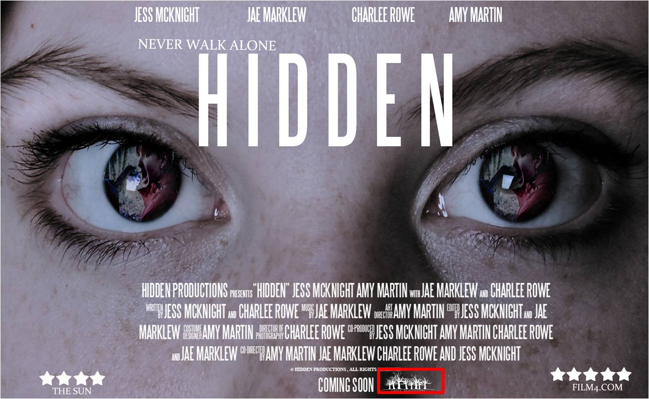
It was very important the the main product "the teaser trailer" had points in it which were easily recognizable in the other texts, through out the blog creation, trailer and posters and magazine covers we stuck to 3 main colors , these were red , white, and black these colors are most common in horror movies as the white and black stand out and the red signifies blood and danger. In the trailer here you can see we have used a blood red bold font for the titles ,and then again in a spooky horror type text for the intertitles.


The spooky like text on the right was then used in the first poster creation which was the teaser billboard poster, this created a noticeable link between the trailer and the start of the ancillary text creations . (see text used in poster below)

At the end of the trailer the film name "hidden" and "coming soon" flashed up in big white writing , this matched the logo at the beginning as that was also in white, we then used this bold white on most of our posters as it was eye catching and professional. Above you can see it used in the trailer and i have highlighted where it was used on the different posters below.


We used images of the main girl Jess in all of our posters and magazine covers as she was seen a lot in the trailer so people would instantly notice her on the posters and magazine covers. We made her look and style on the 2 magazine covers very similar to the ones in the trailer to keep the contiguity as you can see here in a print screen from the trailer and a image from the photo shoot for the magazine.


Her hair is down and straight in both, she is wearing causal clothing and has no make up on in both images to make sure they were as alike as possible.
To make the posters more exciting by including a unique selling point (the pictures in the eyes) and to make them combine with each other we subtlety placed shots from the trailer into Jess's eyes. This is a method used in loads of horror posters such as "The Grudge", "The Eye", "The Ring" and many others. This turned out to be really effective and looked very professional and we received lots of positive class feed back. These are the screen prints of the shots from the trailer used and underneath them the outcome in the posters.


When creating the magazine we used a close up image of the main character, We choose a close up of Jess as there are many in the trailer and it connects the two texts together , She is also the main subject in the trailer therefore we made her the main focus of the magazine cover.
Close up shots of Jess in the trailer-


and here is the magazine cover with the close up of Jess on it.

Overall I think all of our texts (the trailer, billboard poster,theatrical poster,magazine cover and subscribers edition) combine well together and have lots continuity. They all look very much of a horror theme which is very important for the release of horror genre movie as they need to capture an audience which we feel as a group we have done very successfully .We are more then happy with all the texts as a combining package as each one fits the brief and looks very professional and effective and would fit perfectly in the horror slasher movie genre. If we could have made anything more effective i would
Wednesday, 17 April 2013
Evaluation Question 1
Evaluation Question 1: In what ways does your media product use, develop and challenge forms and conventions of real media products?
Monday, 15 April 2013
Teaser Billboard and Theatrical Posters
These were the first posters created for "hidden productions" , These are teaser posters that just give the audience a hint of whats to come. These were created on Indesign and Photoshop using layers of image and texts.Using images of the caravan for the main focus of the posters gives the audiences a idea of the location and setting of the film. This tells them it will be in a woodland/abandoned area. The idea of the teaser is not to give the whole film away and to keep the audience intrigued in the run up to the films release. We believe the billboard and theatrical teasers have done this really effectively and have defiantly made it look like a horror film which will be worth watching.
Billboard teaser poster


Billboard teaser poster

theatrical teaser poster

Sunday, 14 April 2013
Magazine and Subscribers Edition Cover Designs
Here is the magazine cover , this was create using potoshop. To create this magaizne cover we started with cutting around one of the best images from the magazine shoot. There were many to choose from but we wanted one that fited into the horror theme and as you can see in this image she is looking over her shoulder as if someone is whatching her which is typical the the slasher horrors. Below you can see the images from the shoot we had to choose from.


After looking at the all the images we chose the one on the bottom left. So using layers on Photoshop we cut it out and placed we on a black background the added a bold title in the hidden colors red,white and black. Next we added the behind the scene caravan location images and Cover lines for the cover-lines I made them the same font as the billing bars on the posters as it was a really nice clear font to read and using them on both combines them all together. then i added the "hidden title" in a bold red to stand out and included and white glow just like the hidden title in the trailer. Next I added the "50 page pull out" sticker then the bar code , for these I stuck to the same font themes and colors To Finnish off I added the small details like the tag line and web address and the plus sign to make it just like empire the film magazine .
The other magazine copy is a subscribers edition , these normally include less information then normal covers which I have done to ours. I have used a close up image and darken the eye using the burn and highlight tool on Photoshop, I then layered the title empire and hidden tiles using the same ones as on the previous poster to keep the continuity. I then copy and pasted the cover lines just adjusting the positions of the text to suite the new cover. lastly i added the sticker, plus sign and bar-code to make it look like an authentic cover.


Once showing our classes they loved all the posters and were really impressed with our outcomes we also changed all the spellings that were incorrect and took the classes advise and left centered all the cover lines on the 2 covers , you can see the results below.
Corrected Final Copy of Magazine Cover

Corrected Final Copy of Subscribers Edition

Subscribe to:
Posts (Atom)